“Everywhere I go, I see incredible examples of communities that have a vision for transportation and how it will impact the quality of life, mobility, economics and opportunity.” - Anthony Foxx
Mass public transportation is not only a sign of growth - it is also a key factor in the development of major cities around the United States. Public transportation moves people forward. Where are these connections happening? This data visualization project aims to explore the top 10 major mass public transit systems across the U.S. and compare them.
↓
SKETCHES
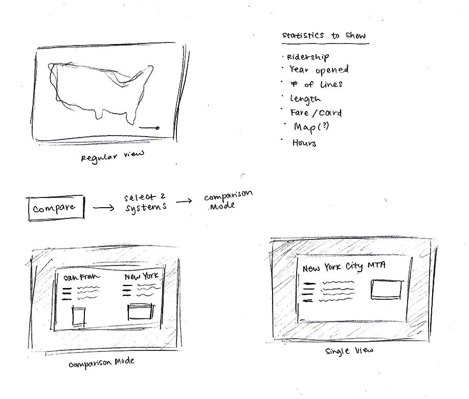
My initial focus was all on the maps. I wanted to create something where people could visualize all the little lines that kept people moving in each city. Then came the idea of comparisons and viewing statistics of each system because I wanted to provide valuable information beyond the visuals.
USER STORY 1
Hi, Jim!
Jim is moving from New York City to Chicago for his job. He relied heavily on the subway to get to work in NYC, so he plans on taking public transportation in Chicago as well. Jim wants to compare Chicago’s transit system to New York’s so he knows what to expect because he is completely new to Chicago’s public transit.
USER STORY 2
Hi, Candice!
Candice is spending her vacation in San Francisco. She has several friends in San Francisco but she wants to explore the city on her own as well. She plans to take public transportation to minimize her traveling costs. Candice needs a way to know what to expect because she feels nervous about visiting an unfamiliar city.
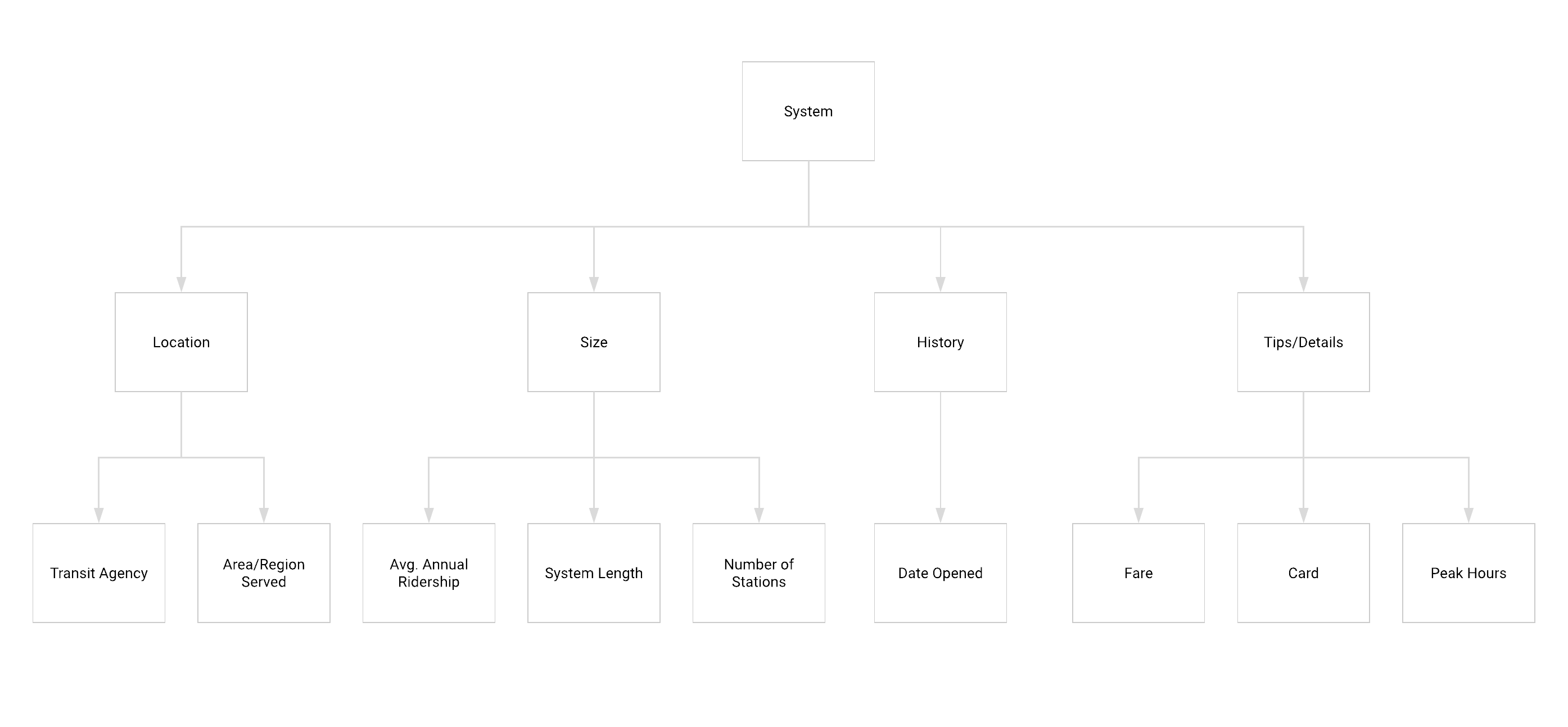
INFORMATION ARCHITECTURE
WIREFRAMES
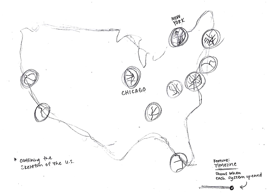
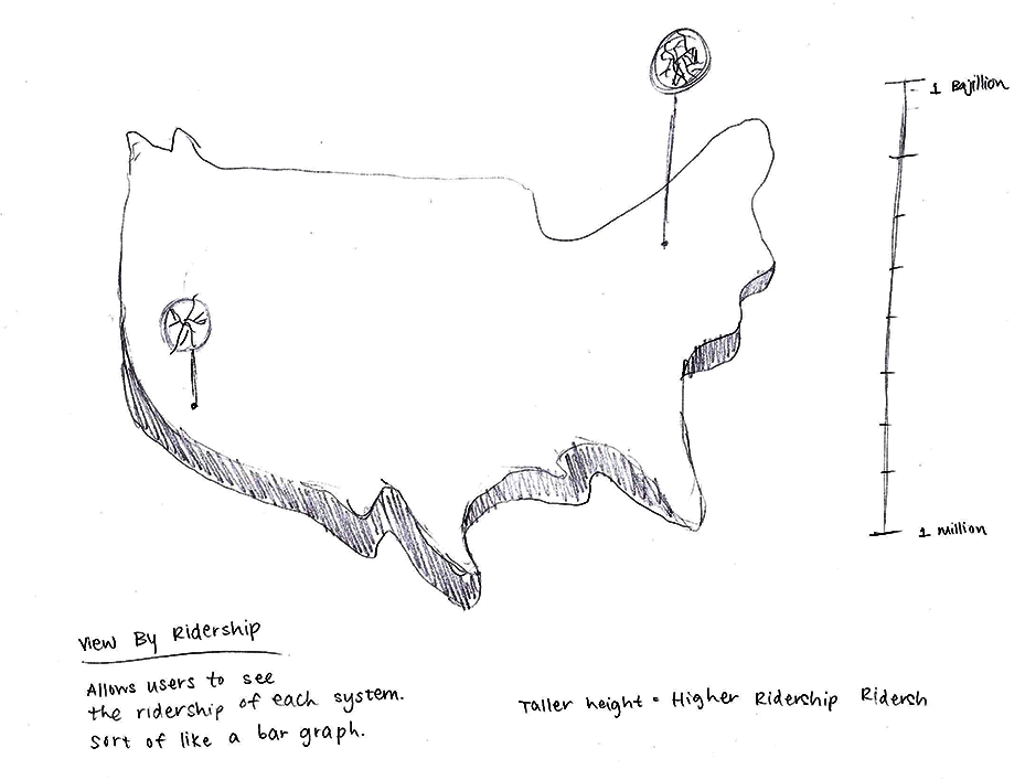
As I was creating the wireframes, I had a lot of trouble displaying the transit maps on the U.S. map. I originally pictured the main screen as just the forms of the maps, however after realizing how tiny they are in actual scale, I decided to put the maps in magnifying bubbles.
MOODBOARD
Clean, airy, minimal, modern, white, and simple.

STYLEBOARD
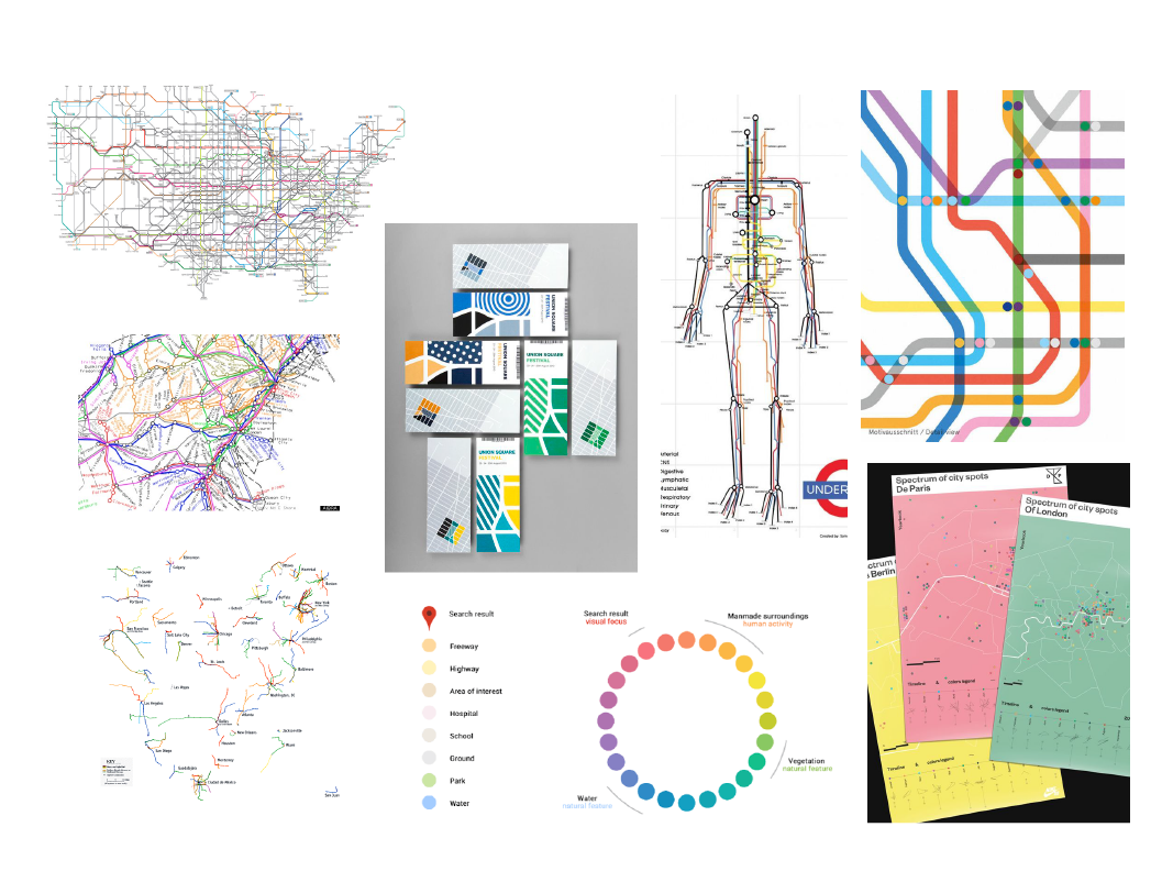
I was extremely inspired by the simplicity of these maps. The forms and the colors of the lines are the focus and the background is almost undetectable. The lines are big, bold, and bright.
Maps can be extremely convoluted, so it was important to keep the other areas of the design as simple and as clean as possible.
Final Designs

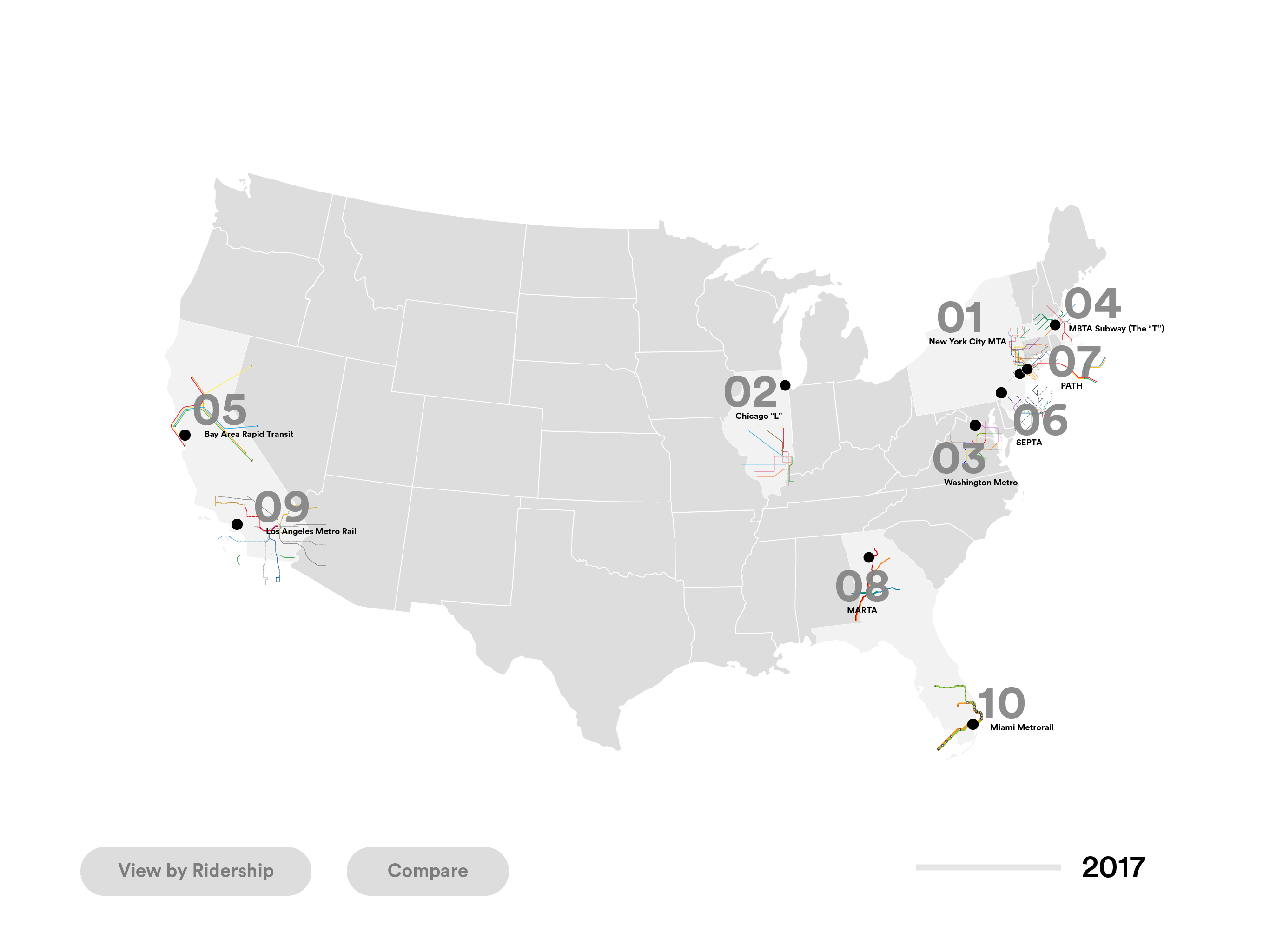
Visualizing Transportation
These are the top 10 major mass transit systems of cities across the United States. Seeing the map was extremely important because it acts as the skeleton of a city. Users can scrub along the timeline on the bottom to see when each system was opened to the public.
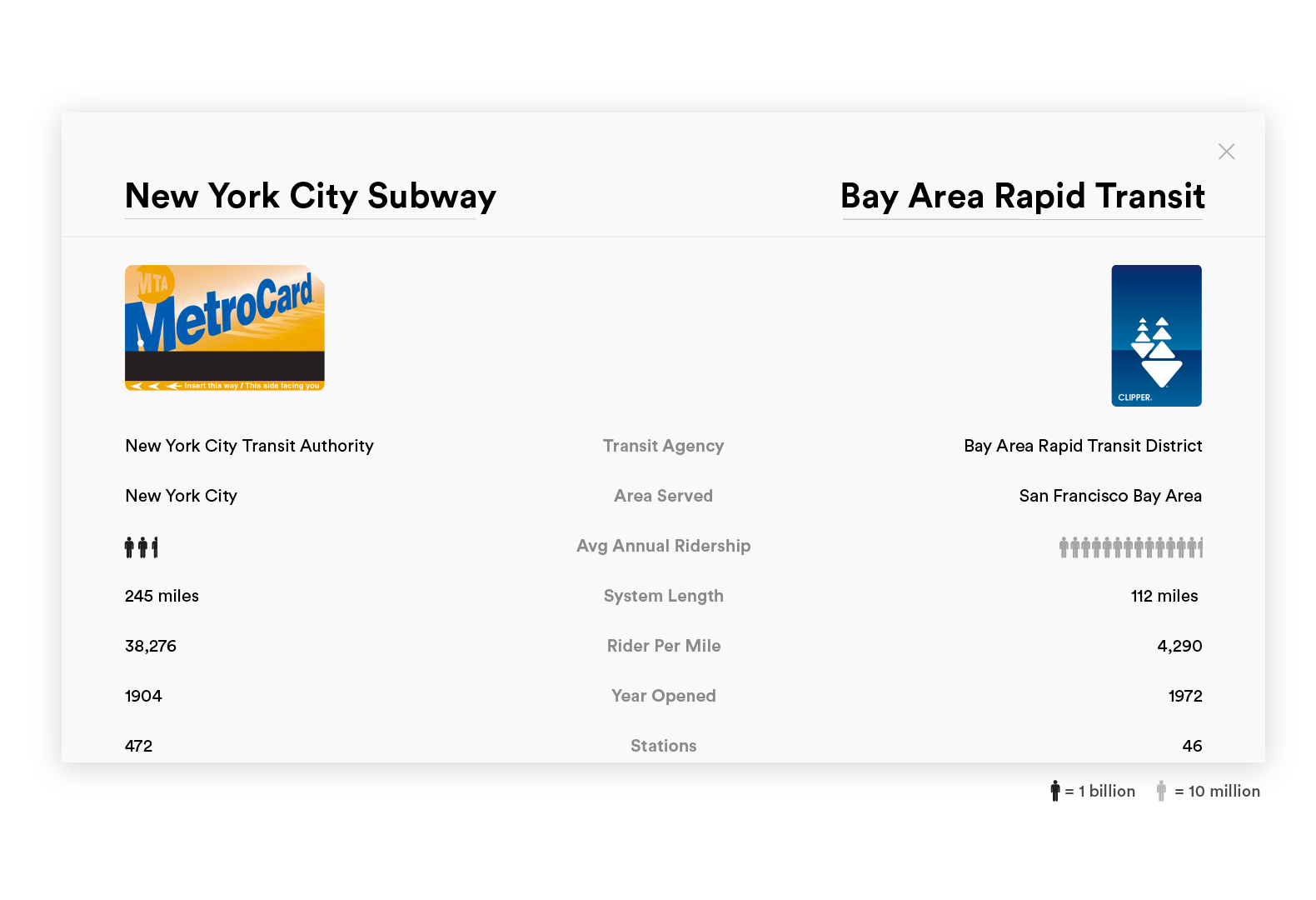
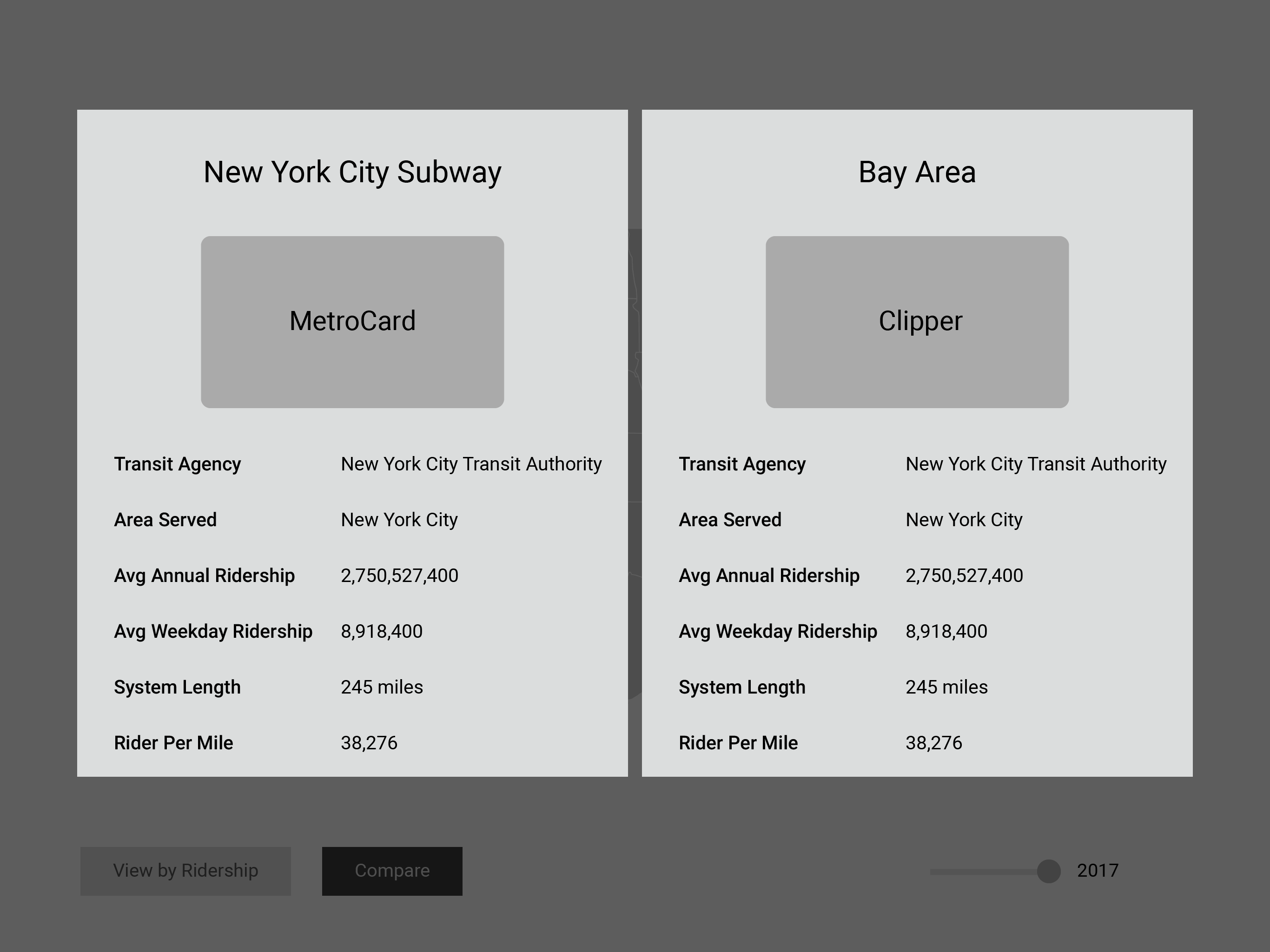
Compare Two Systems
Users can choose two transit systems to compare their statistics. This could be helpful for people moving or travelling to new cities so they can get a sense of other systems.
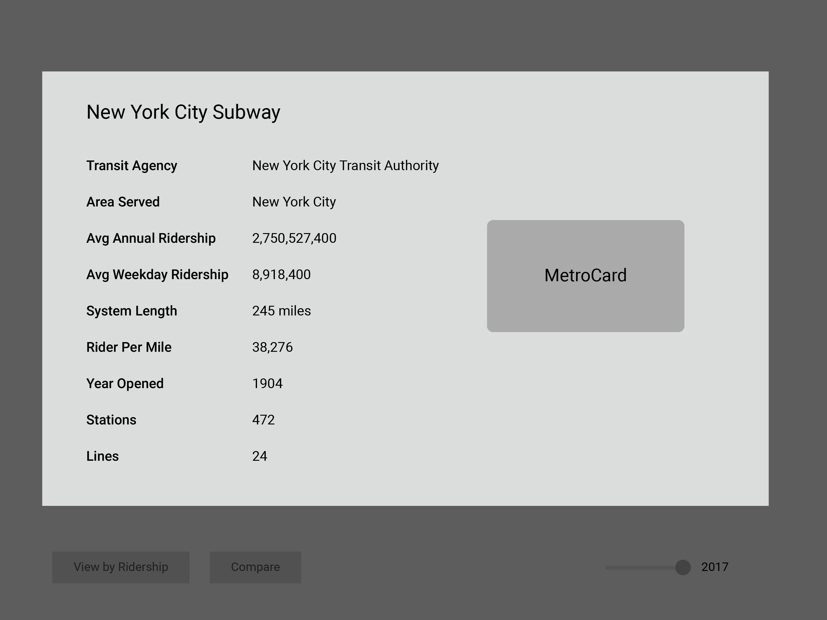
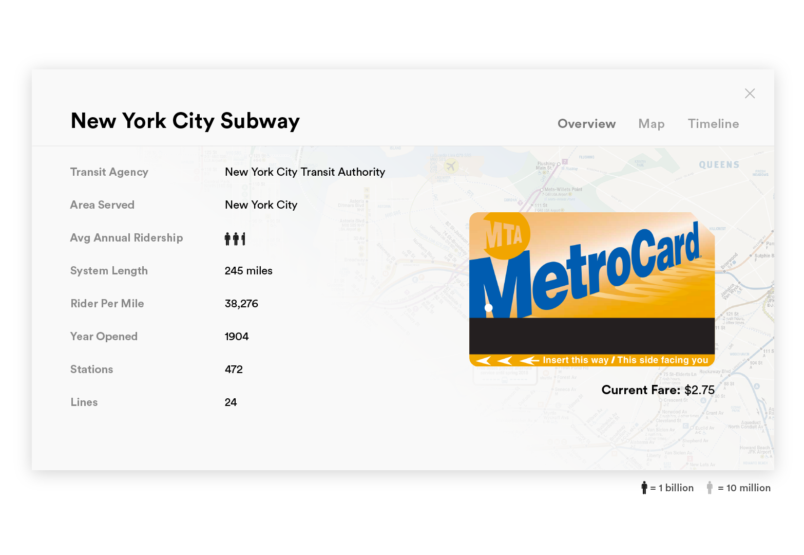
Learn more about a system
Users can also learn more about each individual system. The overview provides statistics about the system, as well as an image of the card and the fare. Each transit system is different from the other, and their cards are completely unique.
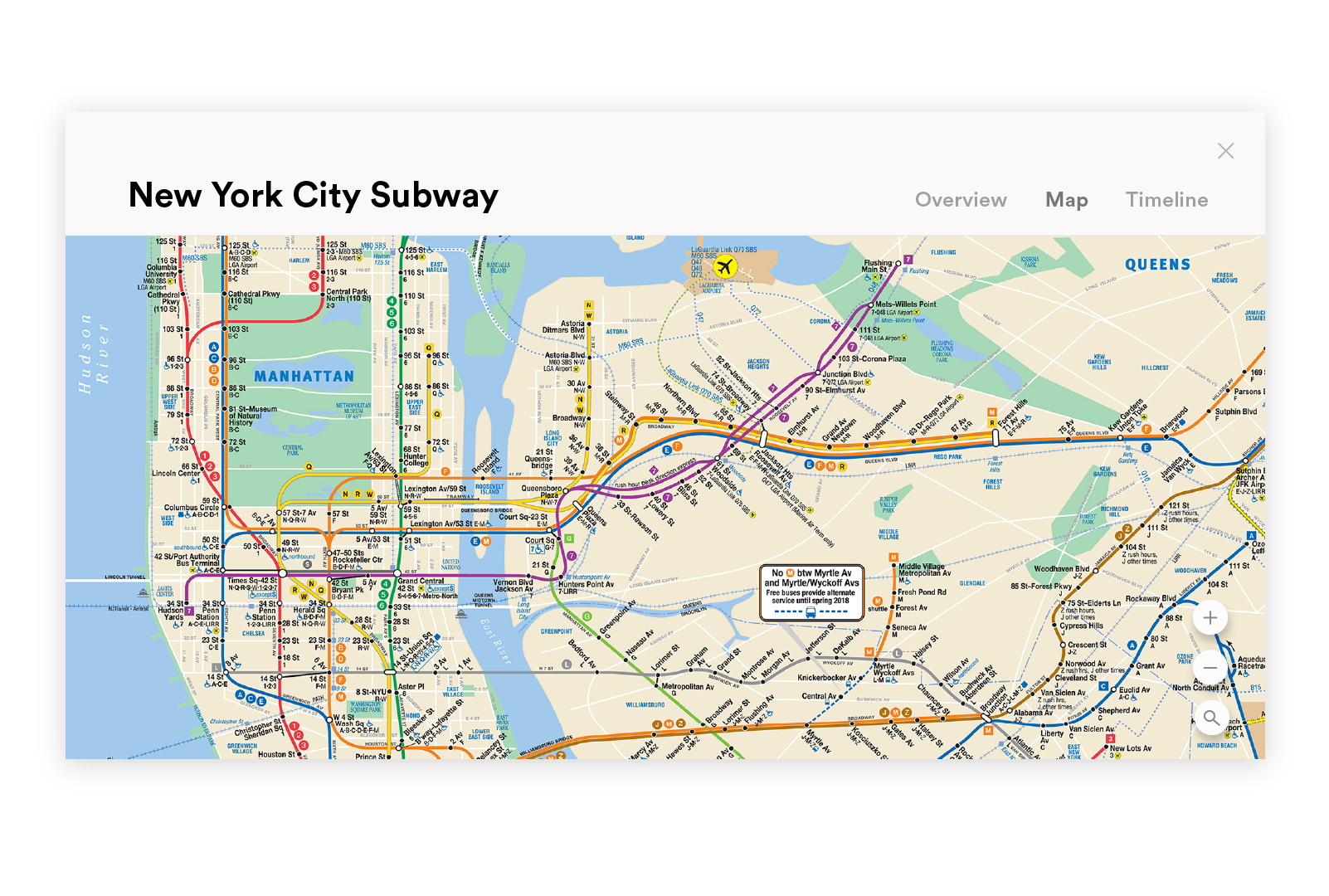
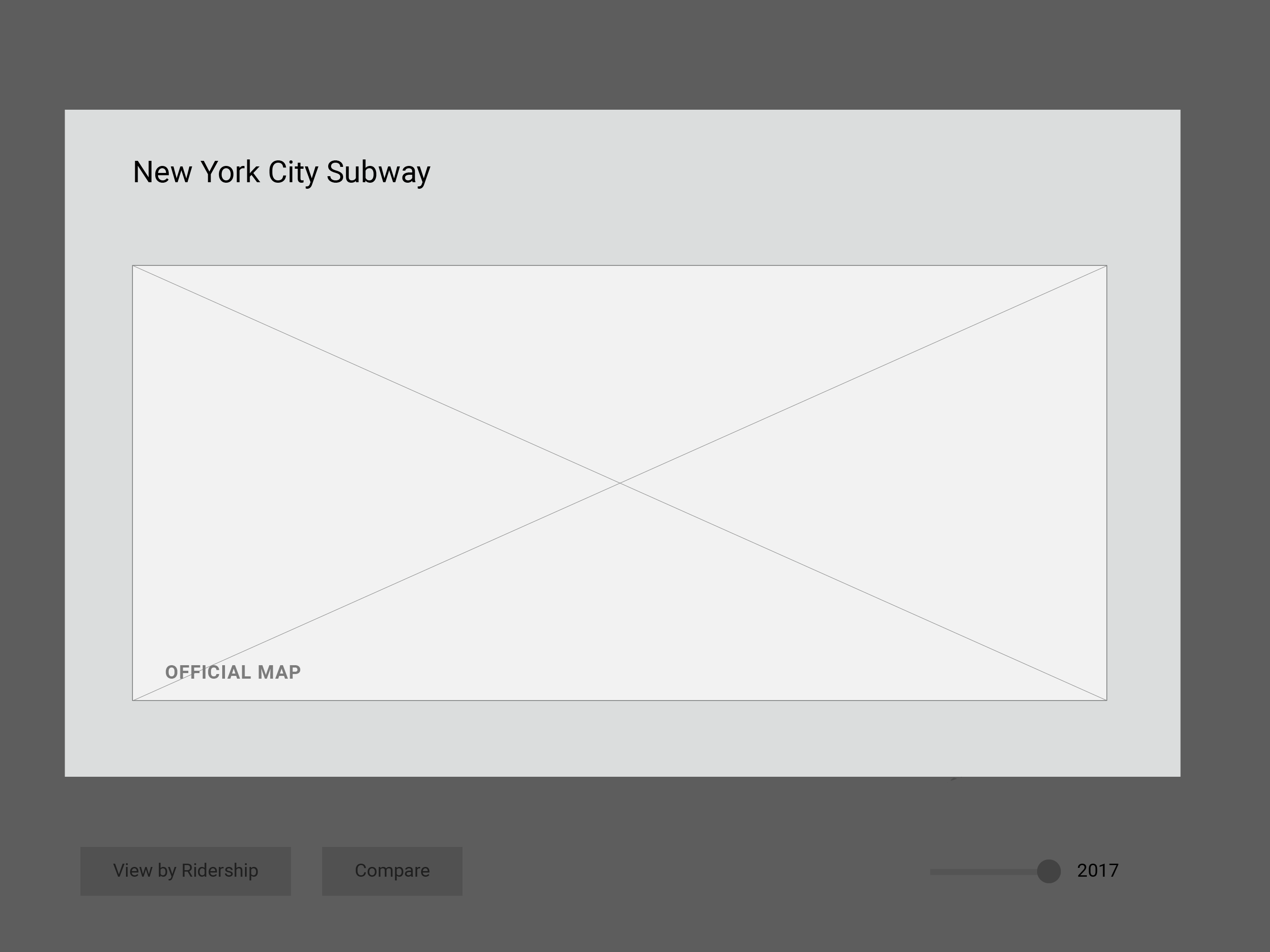
Explore the Transit Map
This is an expanded version of the maps that are shown in the bubbles of the main screen. They are the exact maps that would be found in the stations so they are unique to their system.
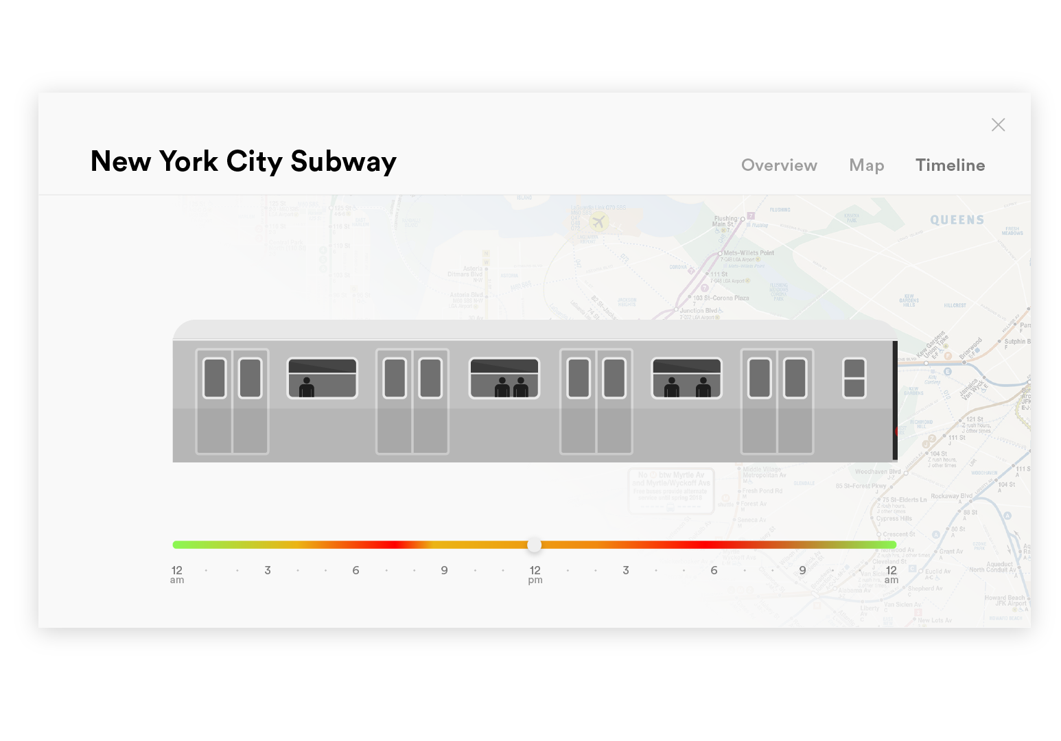
Seeing Congestion
One of the most important factors that can make or break the experience of a trip is how crowded it is. The Timeline feature allows users to have an overview of congestion throughout the day. The red areas on the timeline are the most crowded times of the day. This timeline also lets users know the operating hours of each system. The design of the train cart is modeled after the train carts of each system.
Want to see more? Check out the full process deck!
KATHLEEN HUANG
UI / UX / Visual Design