Brief
USA TODAY is a reputable source that delivers simple and digestible news. While USA TODAY indexes high with older demographics and sports fans, their awareness and usage amongst 22-35 year olds is low. Our goal was to take a mobile-first approach to redesigning the USA TODAY LIFE section in order to create an engaging experience for millennials.
A new mobile experience that delivers relevant content and a personalized newsletter signup.
I partnered up with fellow classmate, Solomon Mercurio, to create a new USA TODAY LIFE mobile website. We focused on delivering trending content to reach millennials and retaining users through the email newsletter. I took ownership over creating a newsletter experience that would feel personal and catered to each user.
Delivering relevant content
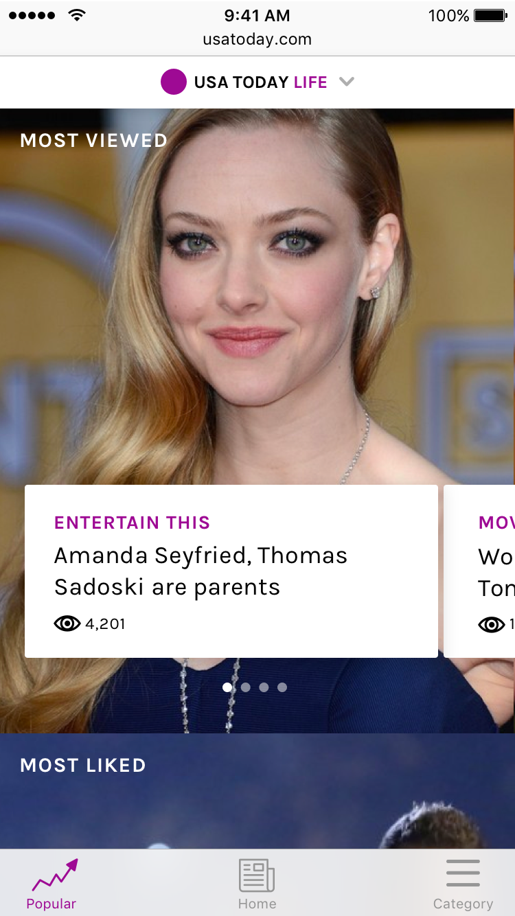
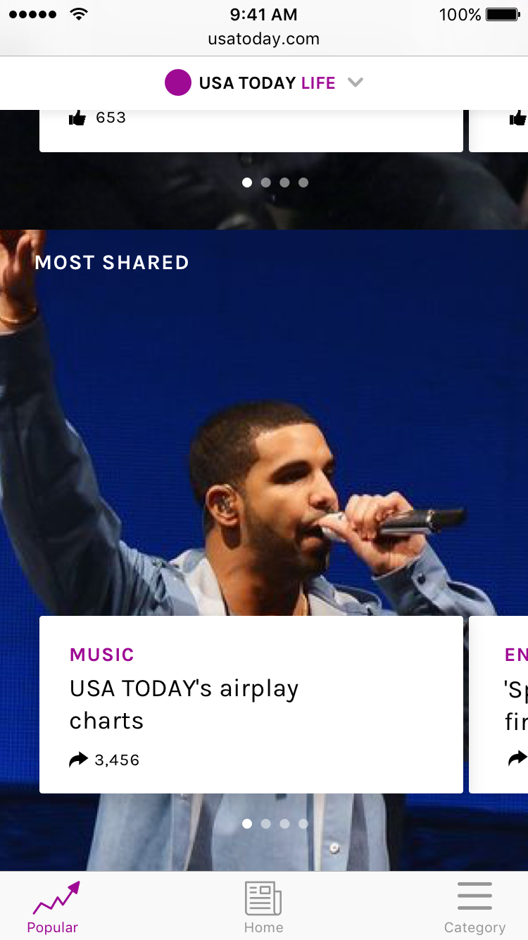
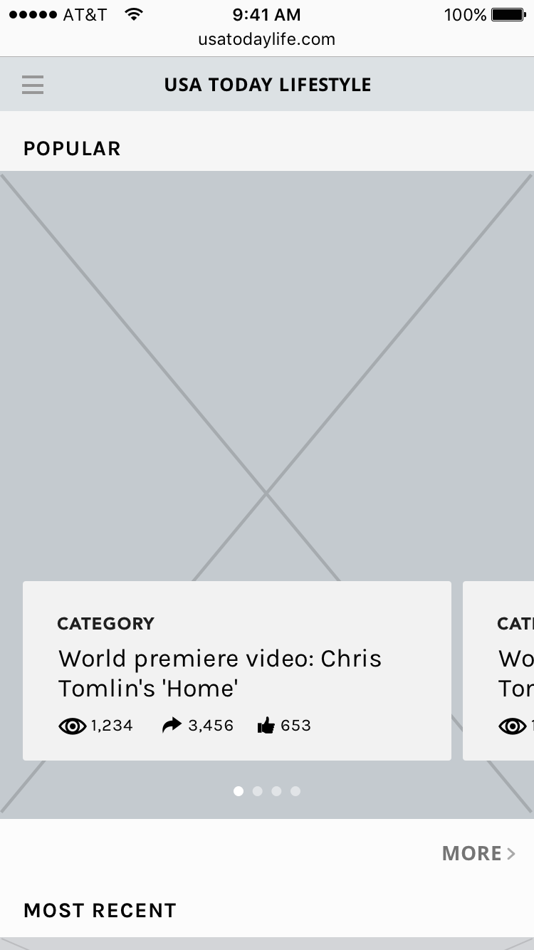
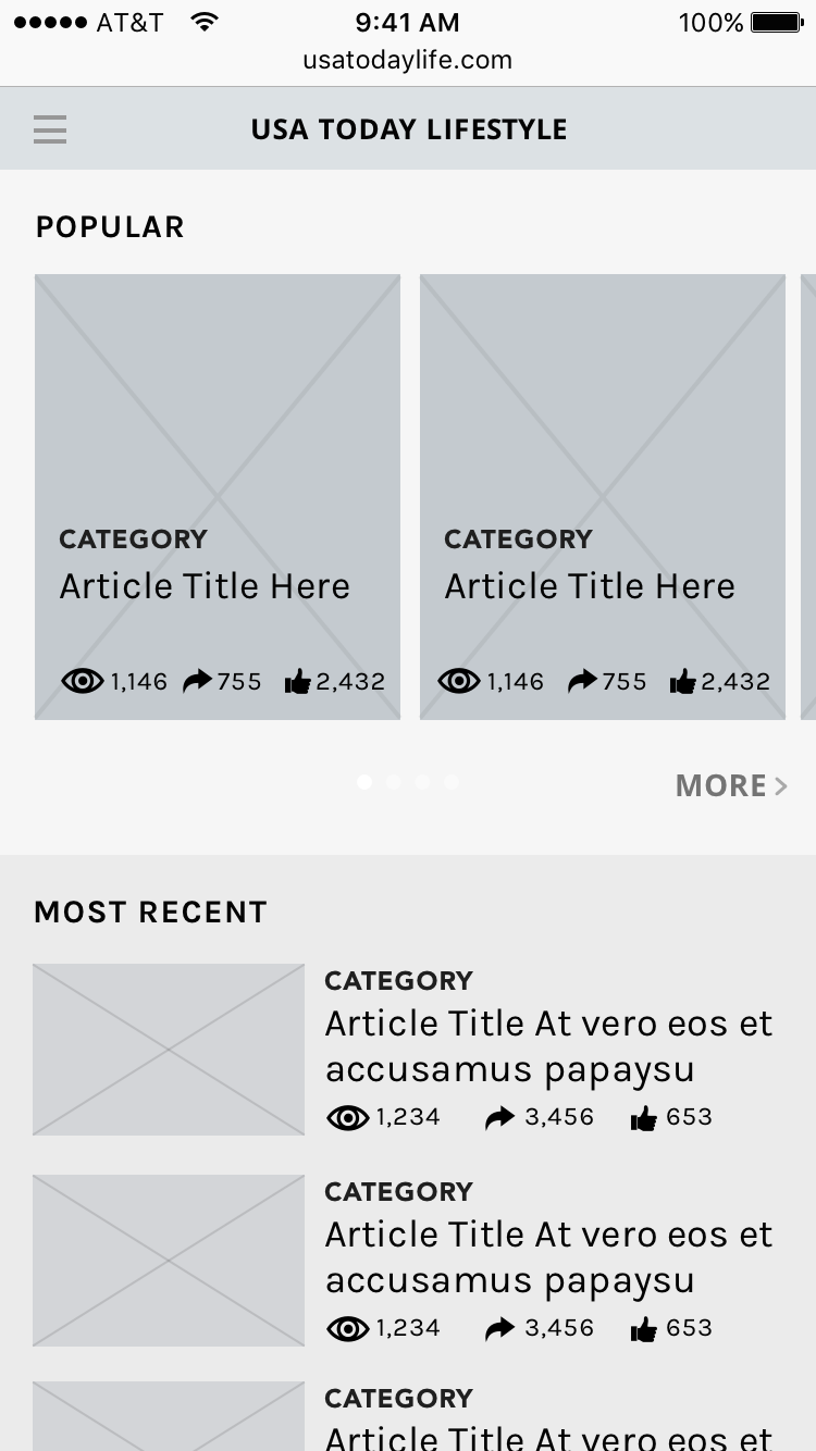
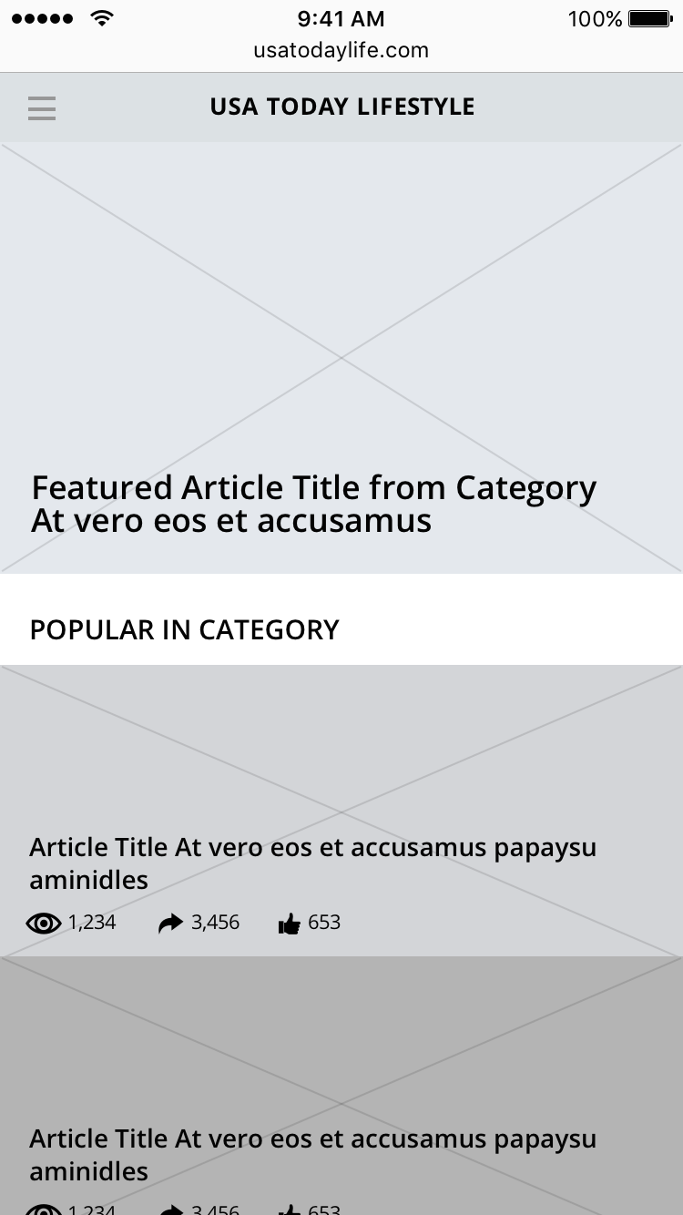
One of the main missions with the new mobile site is to deliver content relevant to the user, measured by popularity. This page is dedicated to promoting popular content through most viewed, most liked, and most shared articles.
Reimagining the newsletter signup experience
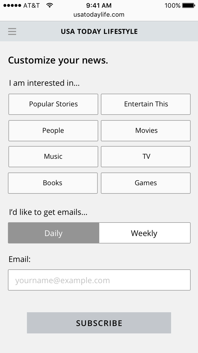
I focused on creating a new email newsletter signup experience. I wanted to allow users to tell us how they wanted their content delivered. If users can tailor it to fit their schedule and interests, they are less likely to unsubscribe.
What are you interested in?
The customization process allows users to create something that fits their tastes. The users determine the type of content they want to receive. Users can also choose the degree to which they customize their newsletter. They can stop at any point by clicking "Finish" or they can swipe to continue customizing.
Everyone has their own schedule.
We allow users to tell us when and how often they want to receive emails, so they don't get overwhelmed with too many emails - a common reason for unsubscribing from newsletters.
Finished!
A newsletter that is tailored to the preferences of each user will result in higher engagement and less unsubscribes.
The Process
"We found that Americans are practically addicted to email, checking it around the clock no matter where they are or what they’re doing."
On average, they spend 6 hours on emails in one day
Millennials are more likely than any other age group to check email
88% use a mobile device to check emails
REASONS FOR UNSUBSCRIBING FROM EMAILS
Users never signed up for it or don't realize that they did.
Users receive too many emails and feel overwhelmed.
The emails aren't optimized for mobile or look unprofessional.
The content isn't relevant to them.
In order to retain users and prevent unsubscriptions, the email newsletters should be customized to fit each individual user. In order to receive input from the user, I focused on creating a customization experience. Users should be able to receive the right content at the right time, so they don't feel overwhelmed.
Measuring Popularity
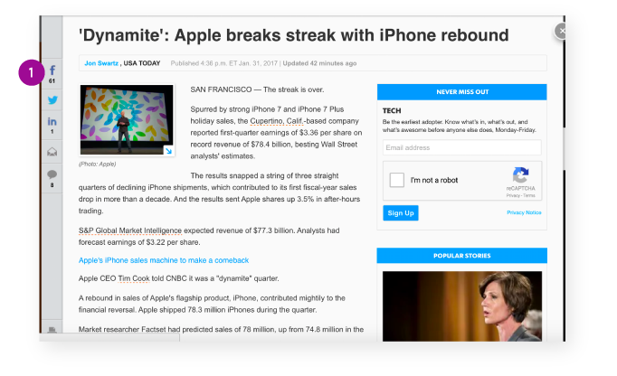
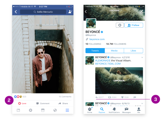
We noticed on the numbers on the side of each article on the USA TODAY website. Media is driven by numbers. Higher numbers - whether that's through likes, shares, comments, or follows - generate curiosity. We also looked at other social media platforms and every post is accompanied by metrics not just to generate curiosity, but also to measure popularity.
POWER USER
Julian
SKETCHES
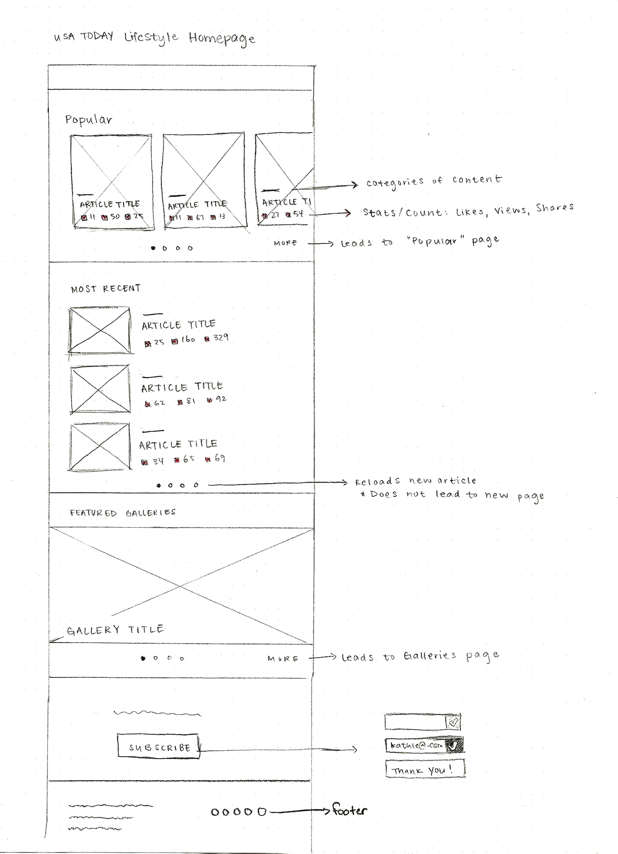
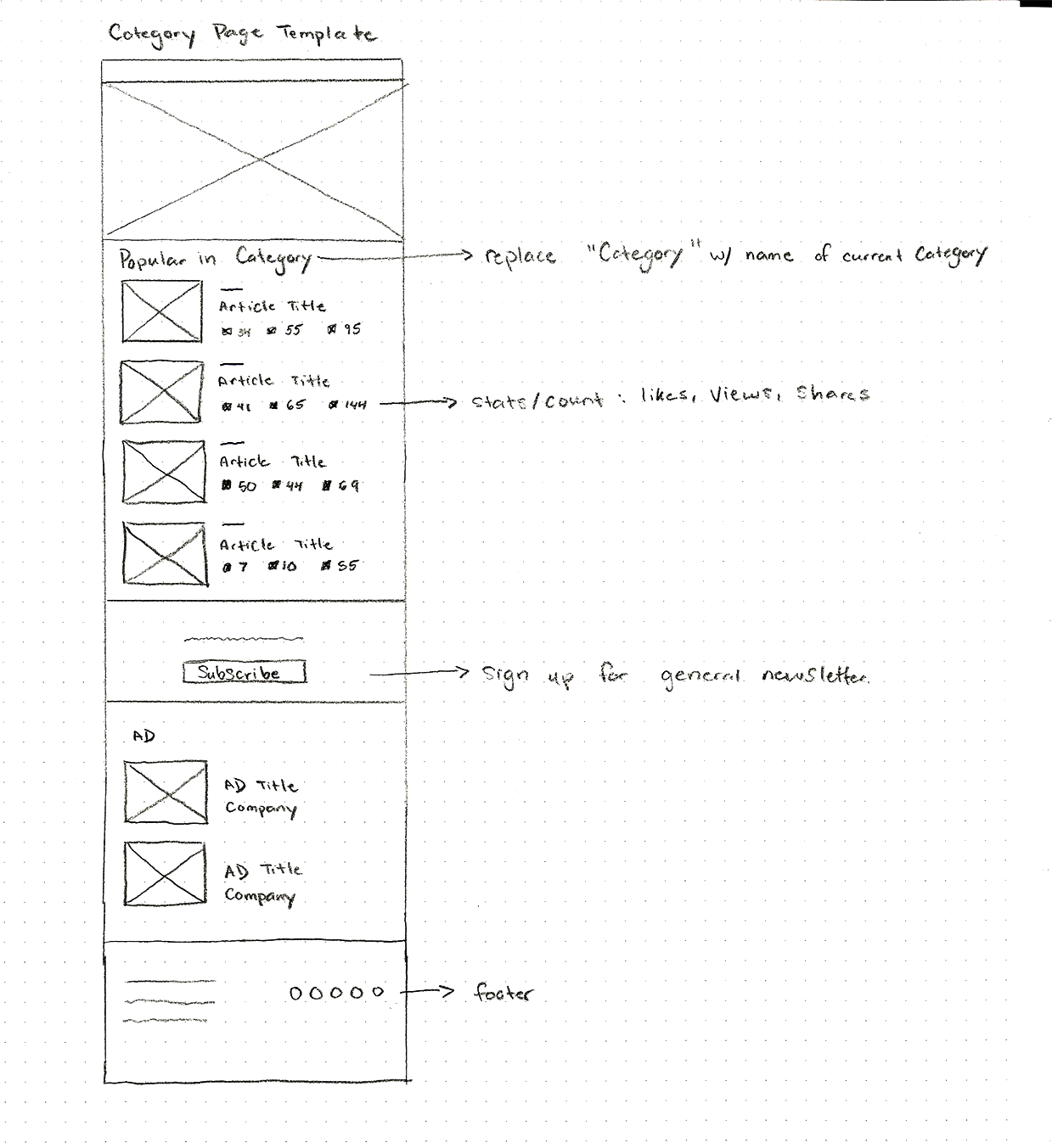
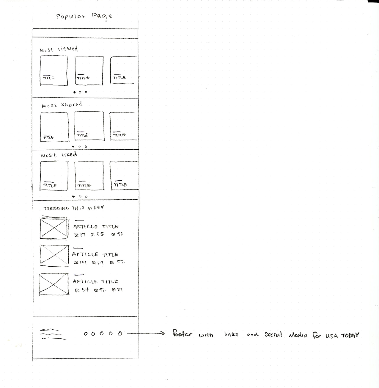
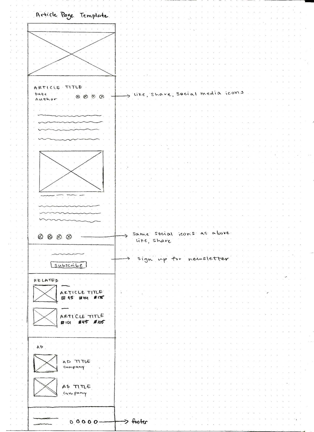
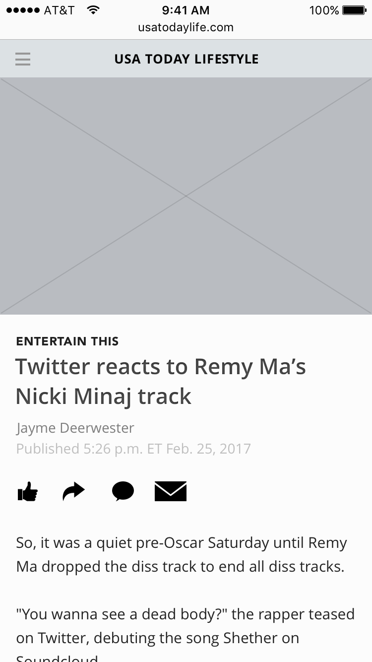
INITIAL WIREFRAMES
The initial wireframes were very exploratory. One thing we realized when designing the homepage and popular page was that it was too redundant. We were showing "popular" content on both pages. So instead, we chose to feature more recent and timely content on the homepage like "Trending This Week." The email customization process was very crowded and boring at first - I eventually decided to break it down into simple interactions.
Thanks for checking this out!
KATHLEEN HUANG
UI / UX / Visual Design

